April 2021
Adobe Illustrator
Visual Design / Poster Design
Graphic Designer

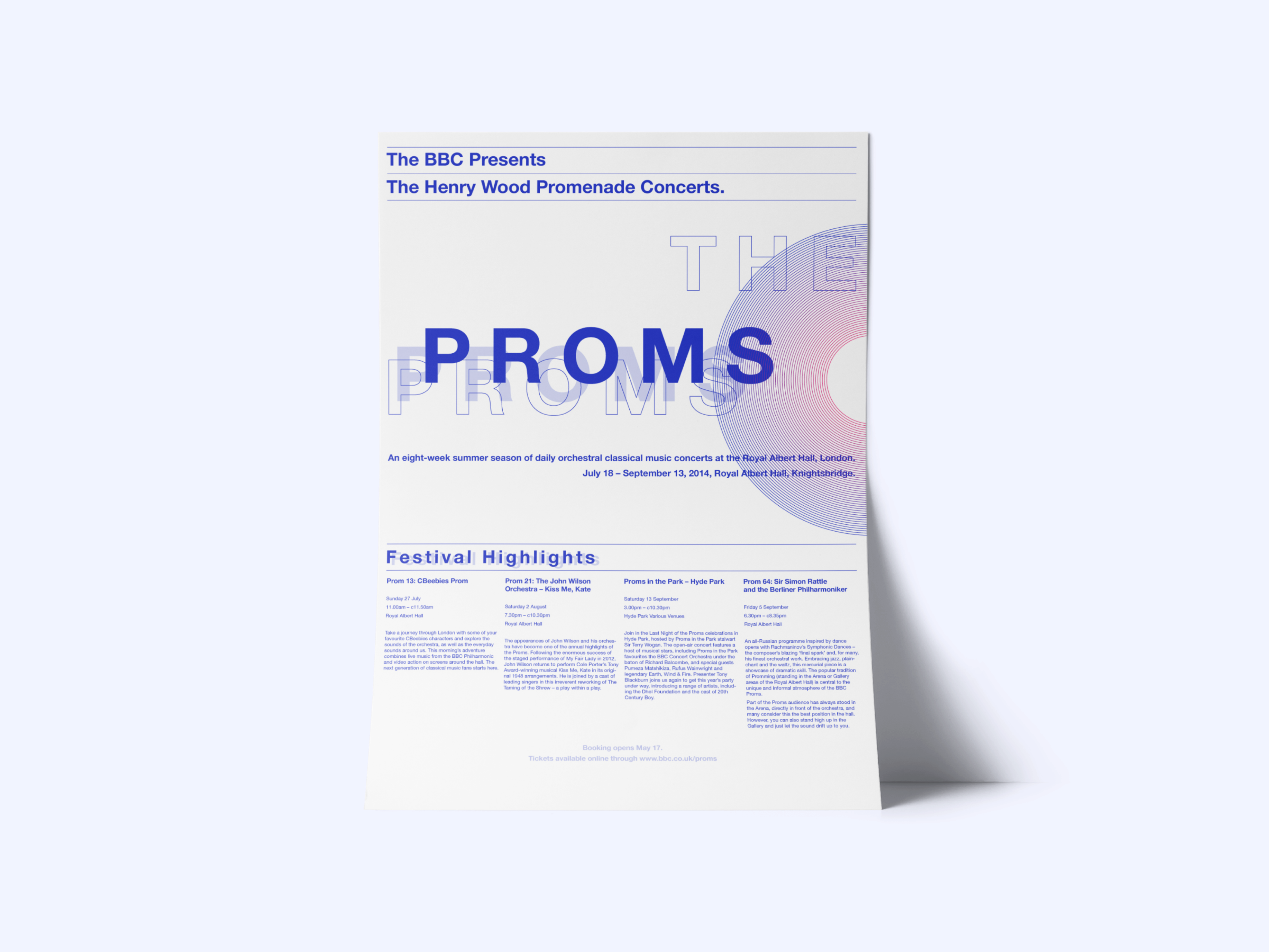
This project is to create international typographic (Swiss style) posters based on precise instructions. I appreciate the idea of the project where the typographic elements must constitute the main “design” of each of the posters.
The typographic hierarchy of the information is carefully considered so that the viewer is able to easily navigate through the content of the poster. Solid tracking, kerning, leading, widow, and orphan control are applied as flawlessly as possible, and the design of the poster communicates effectively whilst being dynamic and eye-catching.
No more than 15% to 20% of illustration and photographic content was required.
Graphic Design
The moodboard helped me visualize the concept for the posters. Since no more than 15% to 20% of illustration and photographic content was required, I planned to design minimalistic posters by using basic lines and shapes. The geometric graphic was created through the inspiration of vinyl illustrations, because the poster is about a music concert.
Though two posters contain the same content, each poster is designed with different typefaces and colour schemes. Blue was mainly used in the sans-serif poster in terms of the colour palette. However, I tried to create variants of blue by using different tints to have enough colour balance with the white background. Black and white were mainly used in the serif poster. To emphasize certain information, I used a yellow that both fits well with the background and is not too noticeable.

There was a provided text that includes information about The Proms event. This information helped prioritize text hierarchy and organize text optimally.


Two typefaces were used as the instructions indicated. For the sans-serif typeface, I decided to go for "Helvetica Neue", which is a clean, neutral font that comes in many weights. For the serif typeface, I used "Baskerville", which is the most popular and classic typeface for print, due to its legibility and refined beauty.


Readable text helps the user process the information in the content. Poor readability pulls users away from the content. I focused on keeping content flow easy and simple by emphasizing important information in bold capitalized letters. Spacing in between text was carefully considered to maintain high readability.

Currently seeking a new opportunity with a company in the business of bettering humankind and the planet.

